Typography
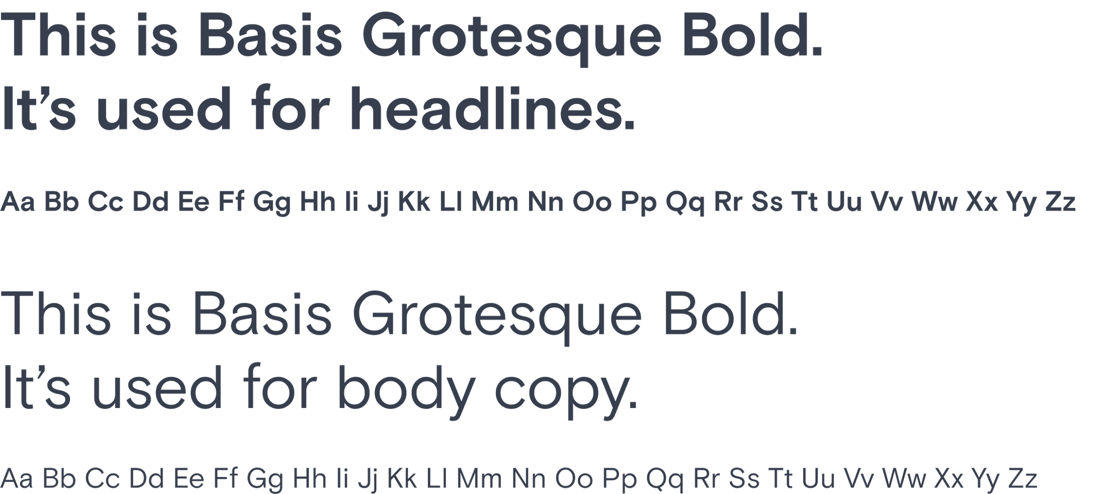
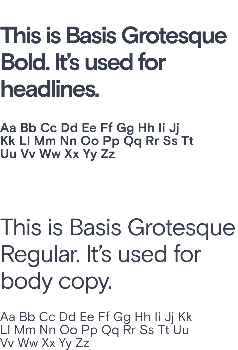
Our primary typeface is Basis Grotesque. Chosen for its legibility and approachable styling, we use it to make our copy sing.
Typography
Our primary typeface is Basis Grotesque.
Chosen for its legibility and approachable styling, we use it to make our copy sing.
Font style
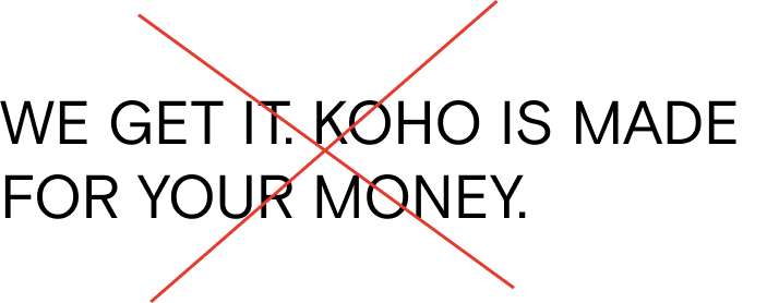
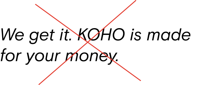
For our type, avoid using uppercase or italics and write in sentence case for headers. Our kerning or letter spacing is 0 and our leading or line-height is 1.5.
Font weight
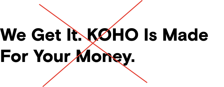
Our font is available in two weights: Bold & Regular
We do not use light, medium, or black nor any italic version.
Font colour
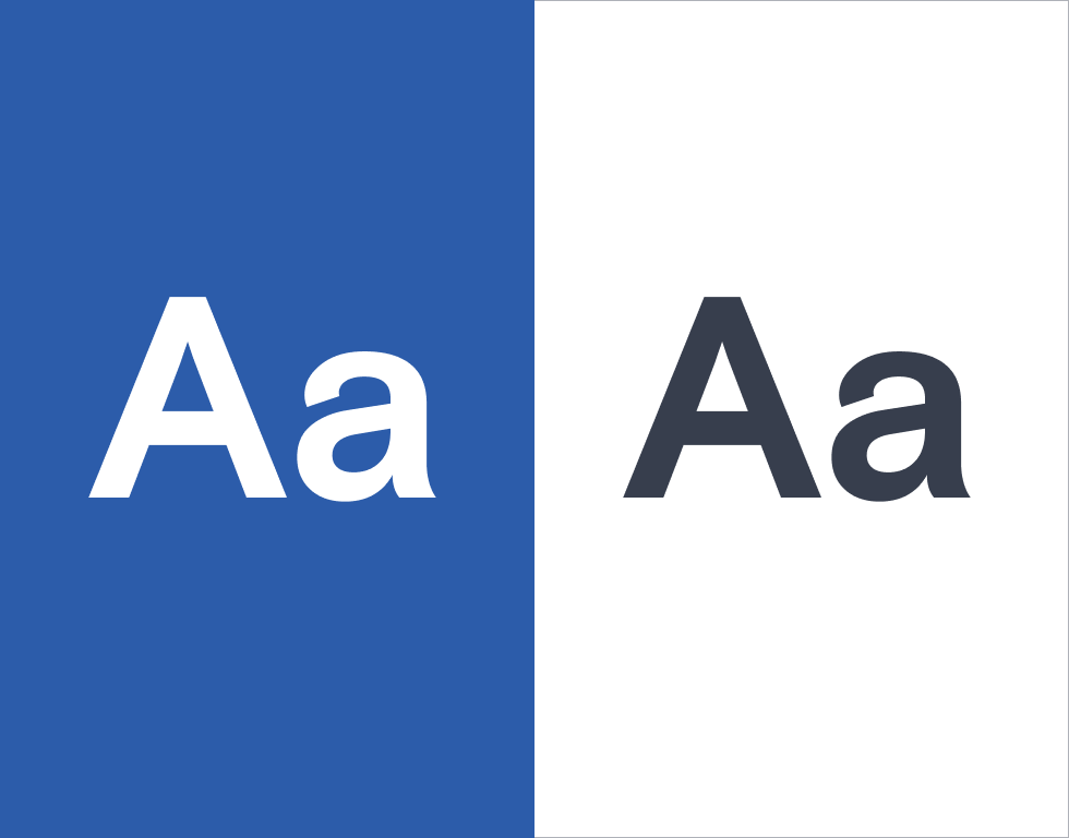
Type is only used in either black or white. On rare occasions, we may use blue or coral to highlight a word in our body copy, however, this mostly applies to email.
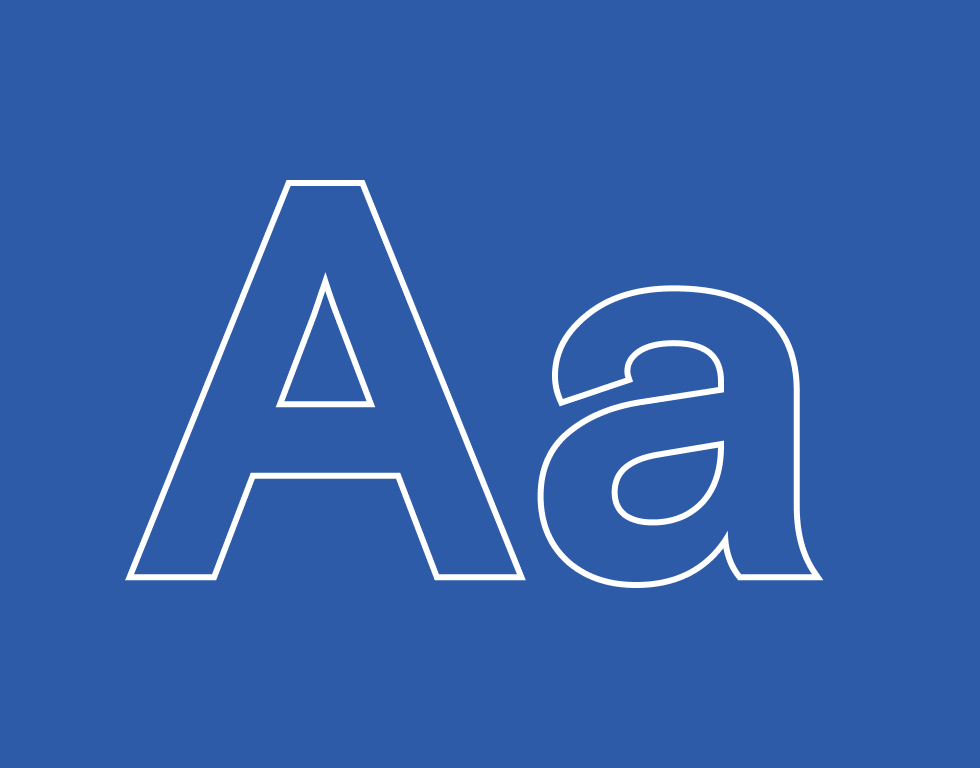
Outline font
A bold outline of Basis Grotesque can be used for headlines when using a solid dark colour background on web or digital. Use a kerning of 0, 1.5 leading, & 2px outline stroke.
Things to avoid
Don’t use all-caps or title case
Don’t use italics
Don’t use an unapproved font weight
Other typefaces
Basis Grotesque should be used in almost every case. The typefaces below are exceptions and are only used in very specific situations.
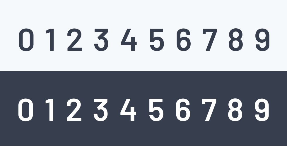
Numeric typeface
Our numeric typeface, Barlow Semibold, is a call back to the traditional numbering on credit cards. It is used for standalone numbers in either black or white and only Semibold.
Alternate font
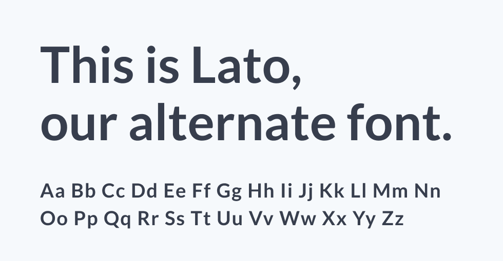
If unable to use Basis Grotesque, our alternate font is Lato, for its legibility and similarities. Use the same kerning, leading, weight, and colour as Basis Grotesque when using it.
