Photography
Polished, original photography, used both in-app and in-marketing is what sets us apart.
The basics
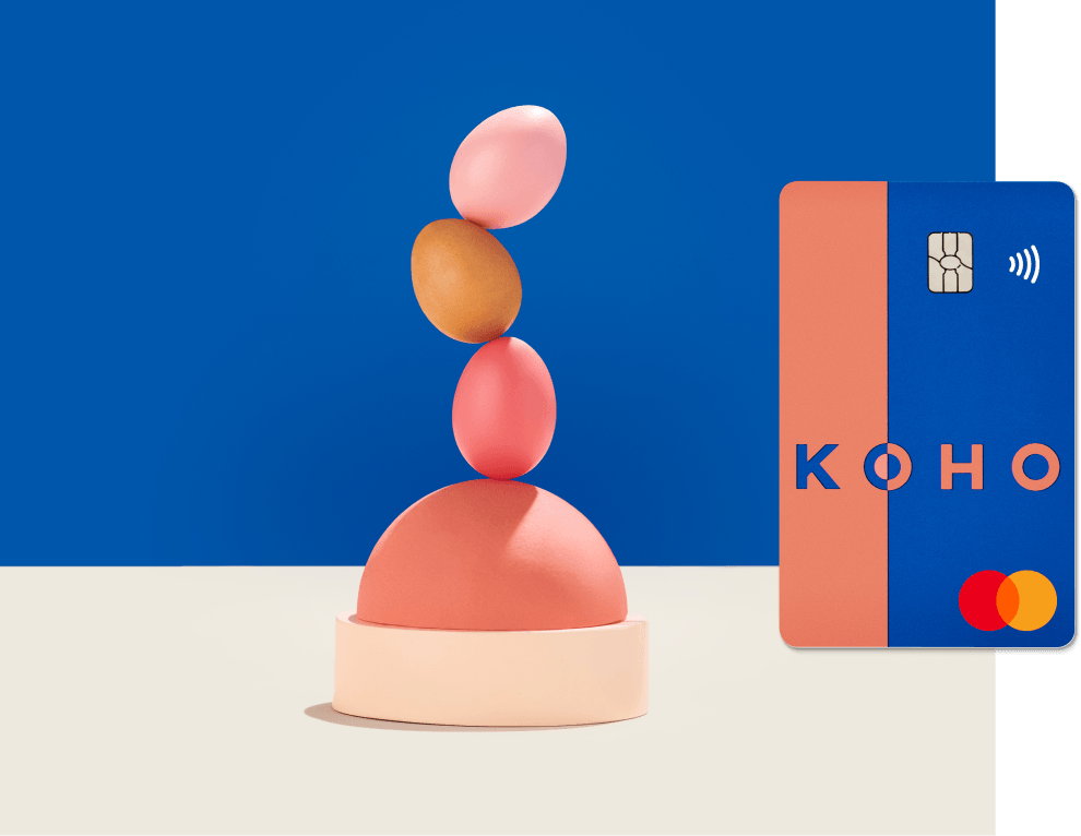
Our lighting is bright and punchy; always. To highlight the focal point of the photo, we utilize whitespace and keep everything in focus. Shadows, should be kept tight and never cut off at the edge of an image.
- Our lighting is bright and punchy; always. We use hard, tight shadows, but never so strong that they hide some of the objects, or cut off at the edges
- We want our compositions to be sharp and crystal clear, so everything should be fully in focus
- To highlight the focal point of the photo, we utilize lots of whitespace around the image
- When it comes to choosing backgrounds, we never use patterns or textures and always keep it seamless without a horizon line
- If there’s money in the shot, the bill should be obscured in some way – this is a federal regulation to prevent the image being used to print counterfeit money, so there’s no exceptions here
- Surprise and delight is always the aim of the game when it comes to our photography


Colour guide
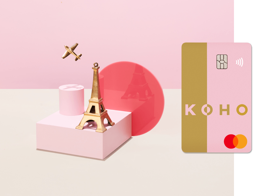
- When shooting, choose one of the KOHO colour combos for each image that can work together through props and background.
- Once the KOHO colour combo dominates, not everything else in the image needs to be exactly our colours. Try squinting at the image – you should always see the colour combo shine though clearly.
- And remember, no horizon line, texture or pattern when it comes to background colours.
This example uses Blueberried Caviar
This example uses Gilded Cotton Candy
This example uses Frozen Cherry Soda

This example uses our Premium colours

Styling
- Our styling is what sets our images apart, so we like to build abstract scenes using a variety of shapes and textures that let the colour combo do the talking
- The props should complement the focal point, not overshadow it
- Not all the props need to match the colour combo exactly, but should quietly complement the main palette and scene, not overpower it
- When including a phone, iPhone or Android, always use the latest model
- Random objects that could be distracting, too specific, or too tenuously linked to the overall scene are best avoided

Use of people
- To add life to our images, we invite hands and arms into our photos in off figure images
- Diversity is important to us, and it should reflect in our images — POC and a variety of genders should be prioritized. Hands and arms should preferably come into the frame from the right side
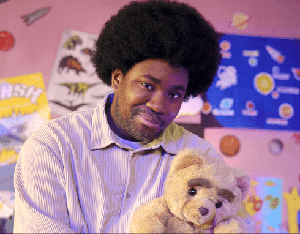
Video
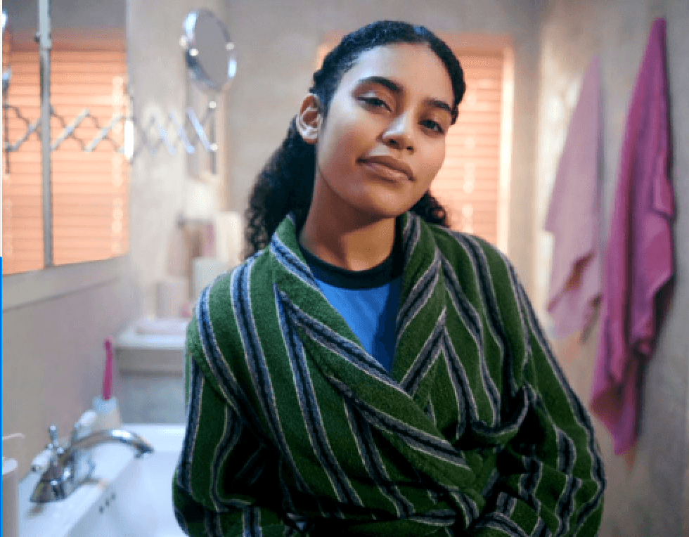
Casting
We always cast with inclusivity and are mindful of properly reflecting the Canadian market, casting a wide net of backgrounds and ethnicities.
Ending slates
All video / film assets should end with the KOHO logo, on picture or solid background. Please abide by all logo guidelines.
