Logo
We’re all about a more balanced approach to finances. Our logo is a representation of that balance.
Logo
We’re all about a more balanced approach to finances.
Our logo is a representation of that balance.
Our logo suite
Split ethos
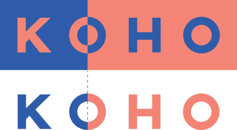
We split our logo at the first ‘O’, always. Balance in real life rarely shows up as a perfect 50/50 split — our logo reflects this.
Primary logo
This is used 90% of the time. Most of our creative will utilize this one. The colour split always happens in the middle of our first ‘O’ and coral and blue is the primary logo colourway.

Secondary logo
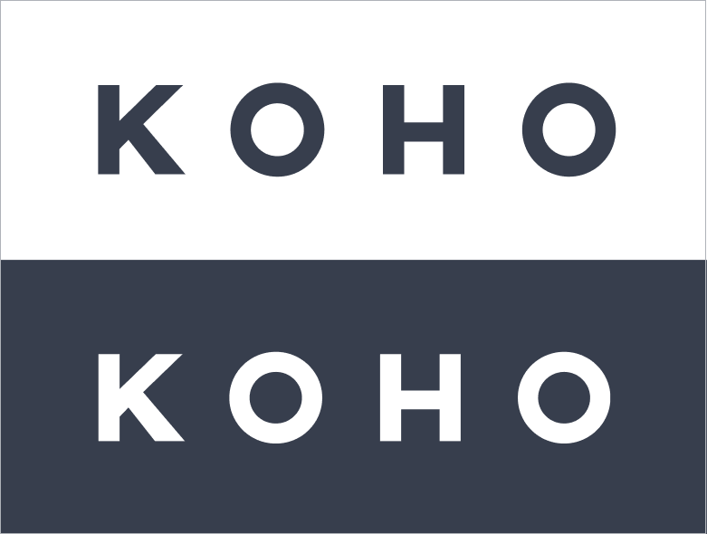
This is used 10% of the time. For legibility reasons, this logo is used in business documents and cases when the font being used is smaller 100px. When using other colour pairings aside from coral and blue, the colour pair should be chosen with the colour background of the intended placement in mind.

Black & white logo
This logo is used only for legal and Terms & Conditions.
App icon
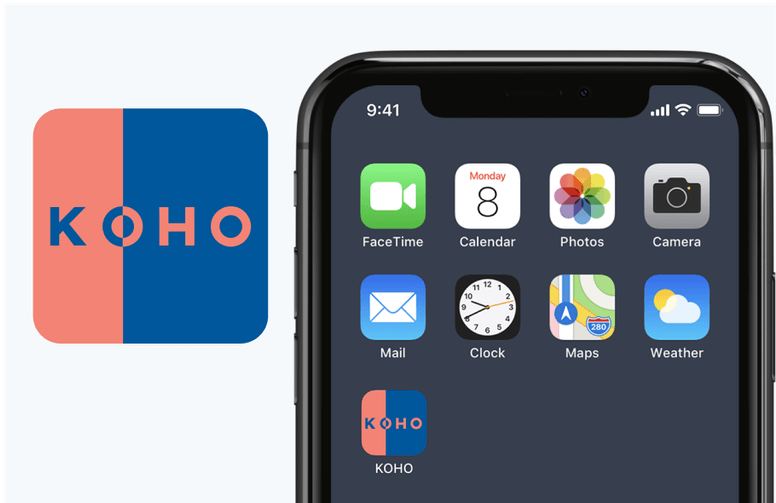
Our primary logo and colours take centre stage within our square app icon. The colour split should always include coral on the left, and blue on the right.
Download our full logo suite
DownloadLogo usage
Clear space
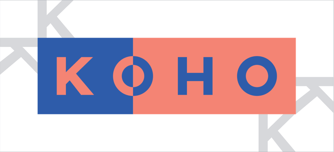
To ensure legibility and a clean layout, we always ensure there’s a space equivalent to the width of the “K”.
Things to avoid
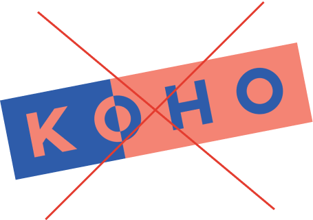
Don’t place the logo on an angle
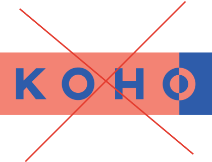
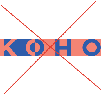
Don’t crop any part of the logo
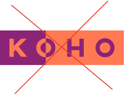
Don’t change any colours
Don’t stretch the logo
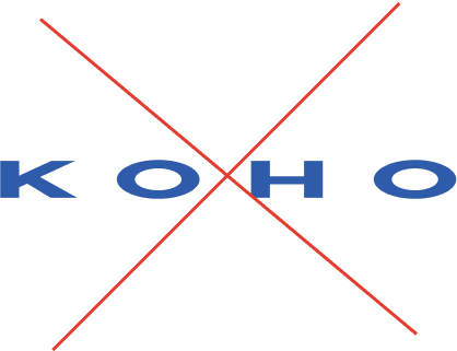
Don’t place the logo in new shapes
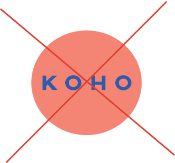
Don’t change the split of the logo
